
Header: Search field
Search field
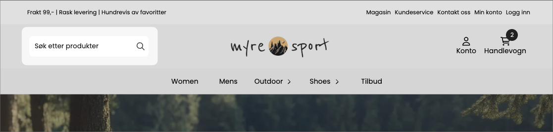
The Search field block places an always-visible search field in the header. Unlike the search icon (which opens a field when clicked), this is a permanent input box customers can type into immediately. Good for stores where search is central to how people shop.
What it shows
A text field, usually with placeholder text like «Search for products…», and optionally a search button. As the customer types, the store's live search suggests matching products. Keeping the field visible at all times encourages people to use search, which often leads to good conversion.
Settings
Setting | What it controls |
|---|---|
Placeholder | The helper text shown in the empty field |
Placeholder color | The color of that helper text |
Show button | Whether a search button should be shown next to the field |
Button position | Where the button is located relative to the field |
Vertical alignment | How the field is vertically aligned in the header |
Colors and border
Setting | What it controls |
|---|---|
Background color | Field fill |
Text color | The color of what the customer types |
Border color | Field border |
Border width | How thick the border is |
Corner radius | Rounds the field's corners |
Use global radius | Use the theme's global corner rounding instead |
Layout and visibility
- Font size — the size of the text in the field.
- Inner spacing (padding) — space inside the field.
- Width-settings for desktop, tablet, and mobile.
- Custom CSS class and block conditions for advanced styling and show/hide rules.
Tips
- Write a placeholder that suggests what people can search for ("Search for products, brands...") instead of a bare "Search".