Layout: Columns for design structure
Columns for design structure
Columns are a cornerstone of the design builder, offering significant flexibility. This article explains how to use columns to structure your Acendy store design.
8 Columns
The design is based on eight columns, allowing you to adjust the content within each section to fit the available columns.

Columns for sections
A section will always span the entire width of the store, but you can specify how many columns each section should be divided into.
If you choose to divide a section into 8 columns, you can place a maximum of 8 blocks within the section before they wrap to a new row.
The image below shows how entire sections are set to be divided into 8 columns. The first block (text block) is set to occupy 6 columns, and the image block occupies 2 columns. Together, this makes up 8 columns, filling the entire width of the section.

By combining different numbers of columns for blocks within a section, you can easily distribute the space each block receives. For example, if you want to divide a section into two equal parts, it can be set up in several ways, as long as it is divisible by two. Example:
Section: 8 columns
Block 1: 4 columns
Block 2: 4 columns
Section: 2 columns
Block 1: 1 column
Block 2: 1 column
Columns in the top menu
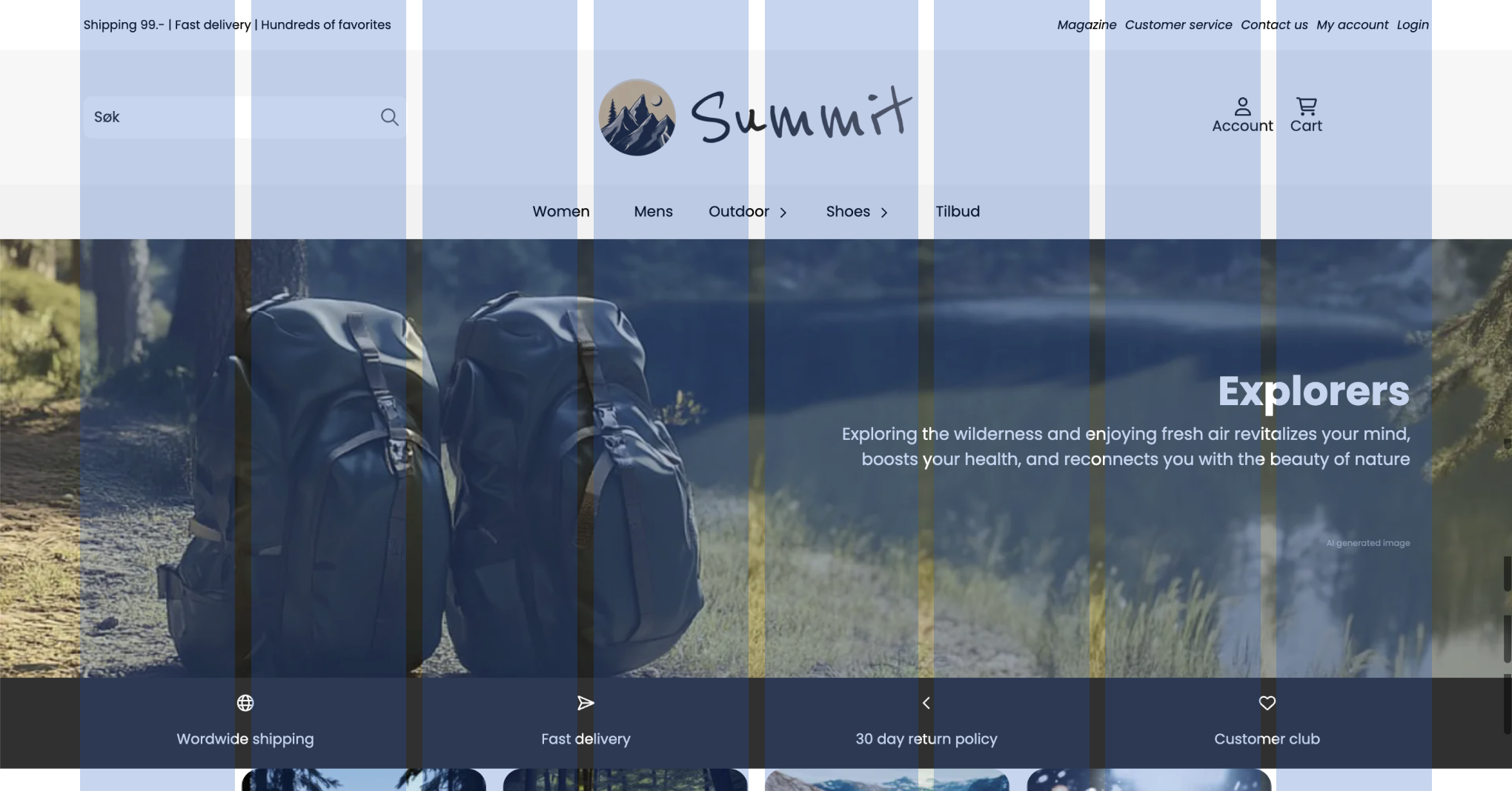
The top menu, or header, is one of the places where understanding columns is most useful. For example, if you want an extra-large search field, you can choose for the search field to occupy 5 columns, while the logo and icons together occupy 3.
The image below shows how the top menu is divided into 3, where the right and left sides both have 2 columns, and the logo has 3.
Furthermore, you can adjust the content for several blocks. Both the logo and icons in the image below have the content center-aligned.

Columns for different devices
To add more flexibility, you can also set different numbers of columns per device!
The image below shows how the product list is set up to use 5 columns on a regular PC, but only two columns on mobile to save space.
Individual adjustments for different devices are supported for all sections and blocks that support column customization.
This means you do not need to create separate sections/blocks for mobile and tablets, but can dynamically adjust the size.
If you combine this with padding, you can create flexible designs that dynamically adapt to different devices.

Advanced settings
Changing and customizing columns is an advanced setting and requires "advanced mode" to be active in order to be adjusted.
Settings and setup of columns can be found under General settings > Advanced settings. Some sections have the setting under layout > Advanced settings.
Some sections also support choosing column spacing and maximum width of the section for even more flexibility.
If there is a need for more customization beyond this, you can use custom CSS.
Related articles
