
Layout: Using margin and padding
Margin and padding on sections and blocks
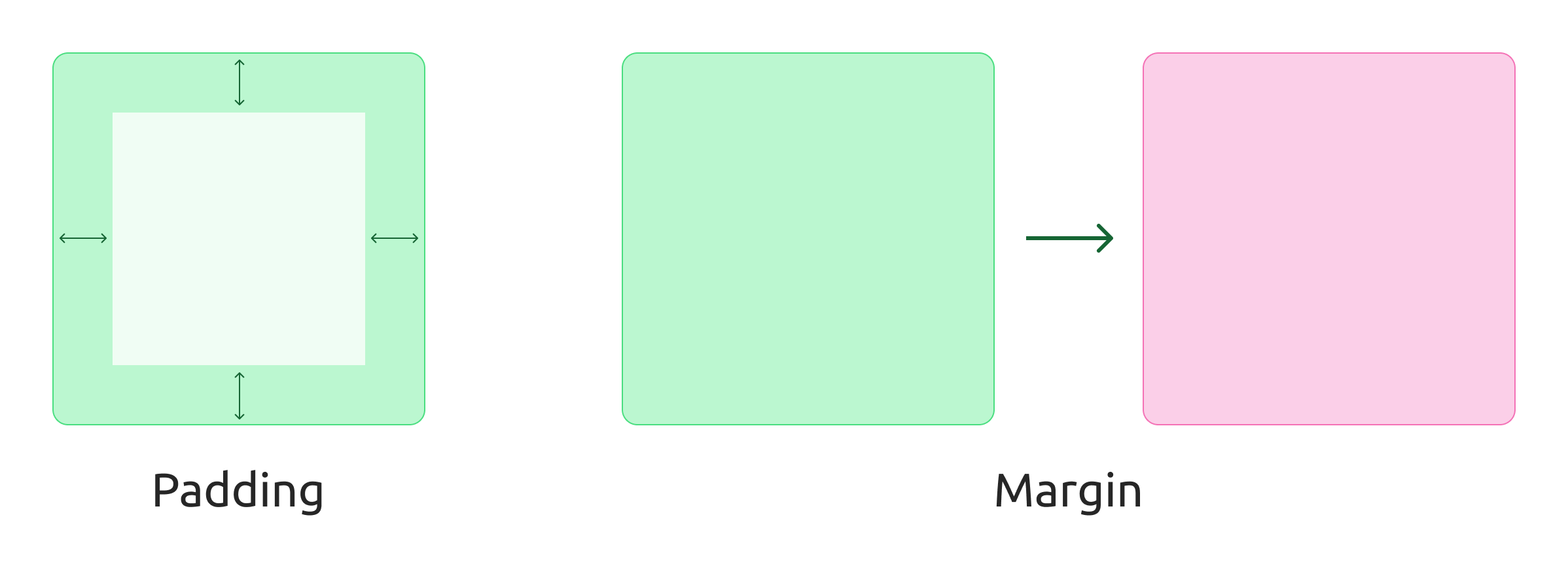
Margin and padding are two fundamental and important concepts in CSS used to control the spacing around elements.
Briefly explained:
Margin: Is the area around the outer edge of an element. It creates distance between the element and other elements around it. The margin can be transparent, and the background color of the underlying element will show through.
Padding: Is the area inside an element's edge, between the edge and the content (text, images, etc.). Padding increases the total size of the element, and the background color of the element fills the padding area.
Think of it this way:
Margin: Imagine having two picture frames on the wall. Them margin decides the distance between each picture frame.
Padding: As the padding inside the picture frame, between the picture and the frame itself.
Customize margin and padding
Most sections and blocks support margin and padding. These settings can usually be found under General settings where they are divided into a setting for margin and one for padding.
Open the margin/padding setting
Turn on padding for the desired device
Adjust how much margin/that is desired by entering the number of pixels.
"Inherit" settings
If you choose to adjust the settings for desktop (PC) only, the other devices will inherit the settings. That is, the desktop is always "boss", and unless otherwise set, the smaller devices will have the same settings.
For example, if you want the desktop to have 20px in padding but the mobile to have 0px, you must actively turn on padding for the mobile and set the settings to 0px.
It also means that if all devices are to have the same margin/padding, it is enough to make the setting on the default choice for desktop.
Customization per device
Previously, the design builder only supported one overall margin/padding per section/block, but in January 2025, it gained support for unique settings per device.
This means that you can very easily ensure that sections and blocks look good, regardless of device. For example, you may not need extra padding on a PC, while on a mobile it may be nice to get a little extra air around the elements.