
Dashboard in the control panel
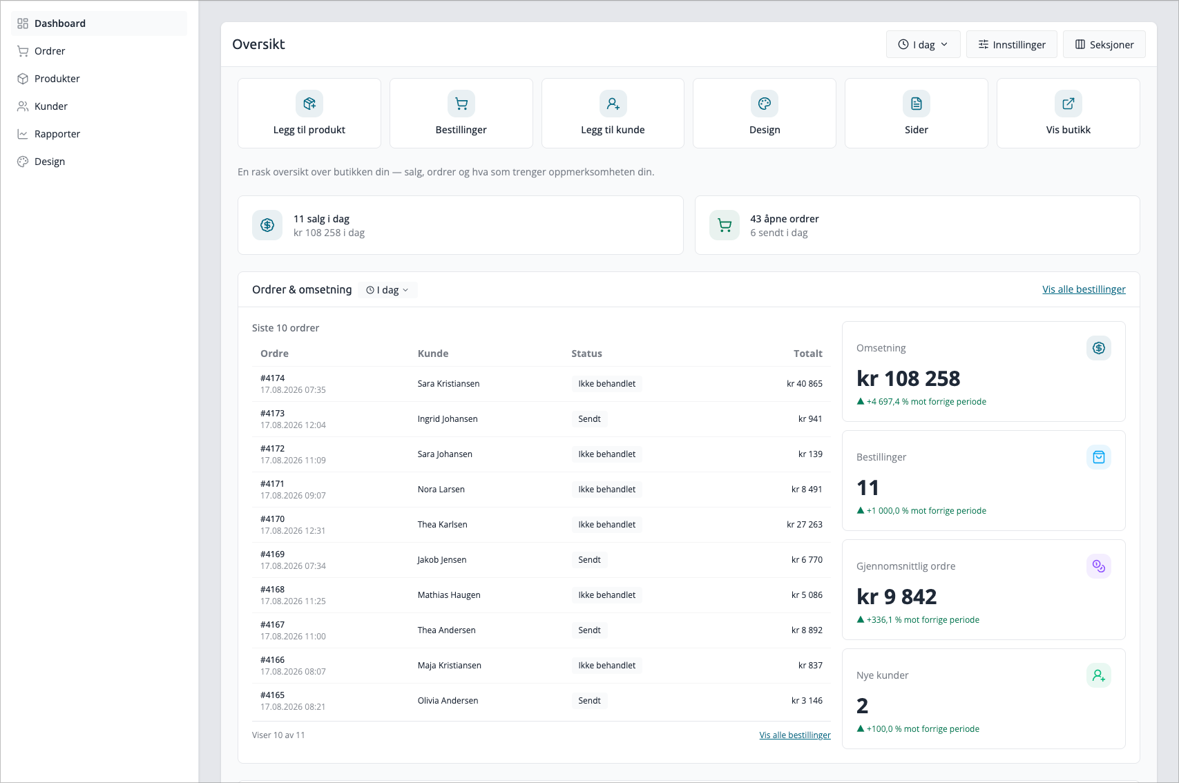
The dashboard is the homepage in the control panel. It gathers sales, orders, inventory value, and pending tasks, so you can see the store's status without opening a single report.
You can find it under Dashboard, in the sidebar menu. The page itself is called Overview
What the numbers cover
All order figures on the dashboard apply to the entire store — both online store and POS system. Canceled orders are always excluded.
This distinguishes the dashboard from the POS dashboard, which only shows sales made in the POS system. If you see a higher number here than in the POS system, it is usually the online store sales that make up the difference.
Top bar
At the top of the page are three controls that govern the rest of the dashboard.
Period selector
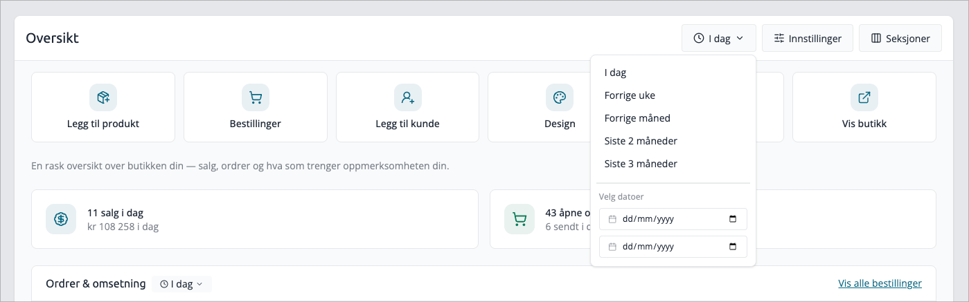
Selects the time frame over which the key figures are calculated:
Option | Covers |
|---|---|
Today | From midnight until now |
Last week | The last 7 days |
Last month | The last month |
Last 2 months | The last two months |
Last 3 months | The last three months |
Custom period | From and to date you choose yourself |
If you select dates in Custom period, the selector automatically jumps to that period. If you select one of the fixed options again, the dates will be reset.
The period selector is the starting point for all sections that have a period. Some sections have fixed windows that cannot be changed, and they will indicate this themselves — see Which sections follow the period
Sections with their own period
Each section that has a period shows a small badge at the top with the period it actually uses. This means you don't have to guess which numbers apply to what.
- Grey badge with clock — the section follows the period selector at the top.
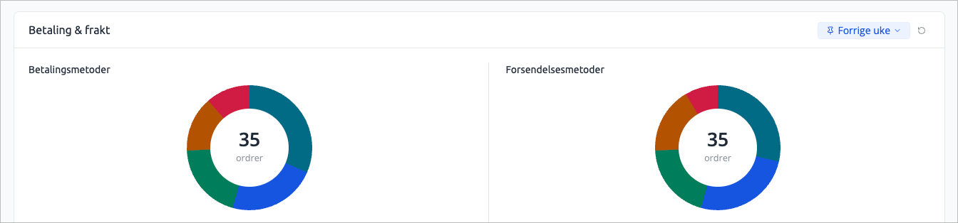
- Blue badge with pin — the section has its own period and does not follow the period selector.
Click the badge to give that specific section a different period. The badge turns blue, and a small button with an arrow appears next to it. If you click the arrow — or Follow dashboard period in the menu — the section will revert to following the top bar.
Sections with fixed windows also have a badge, but it is not clickable. It is there to explain why the period selector did not move them.
The selection is saved to your user account, so a section you've given its own period will remain that way the next time you log in. If you have at least one such section, the top bar will show «N sections have their own period». Click it to set all sections back to the period selector.

Settings
Three toggles that determine how revenue is calculated:
Setting | Effect |
|---|---|
Show values without VAT | Revenue is shown excl. VAT instead of incl. VAT. |
Exclude shipping from graphs and revenue | Revenue is calculated on product lines only, without shipping |
Include return orders in graphs and revenue | Returns and credit notes are deducted from revenue |
Press Save, and all sections will be recalculated with the new basis. Bestsellers and Best Brands are only affected by the VAT switch — an item that has been returned never counts as a bestseller, and shipping is not a product line.
The settings are saved to your user account. If you change them, you only change your own dashboard — colleagues in the same store keep theirs.
Customize
Here you control which sections are displayed and in what order. See Customize the dashboard
Quick Actions
Below the top bar are six fixed shortcuts: Add productOrdersAdd customerDesignPages and View store. The last one opens the online store in a new tab.
The row cannot be hidden or moved.
Get started
New stores get a dedicated card with a checklist of what needs to be in place before the store can open. Each item is automatically checked off when it's actually done — it's not something you check off yourself.
Steps | Considered complete when |
|---|---|
Add your store details | The company name is filled in |
Upload your logo | The store has a logo |
Add your first product | The catalog has at least one product |
Configure a payment method | At least one payment method is installed |
Configure shipping | At least one shipping method is installed |
Customize your design | The store uses the Design Builder template |
Receive your first order | The store has at least one order |
The first two steps are only shown in demo stores. The first unfinished step is marked Next step and has a Start button that takes you directly there.
The card disappears when everything is checked off. In a demo store, it remains, because the welcome message shares a card with the checklist.
Sections
The dashboard consists of twelve sections. All can be hidden and moved.
Section | Shows |
|---|---|
Store Status | Sales today, revenue today, open orders, and how many have been shipped today |
Orders & Revenue | The latest orders in the period, with key figures for revenue, number of orders, average order, and new customers |
Orders per hour | Number of orders distributed by time of day, this year vs. last year |
Average Order Value | Average order distributed by time of day, this year |
Sales | Revenue day by day for the period you select, compared to the previous period of the same length |
Bestsellers and Brands | Top 5 products and top 5 manufacturers |
Inventory Value | Cost price, sales value, profit, and margin in inventory over time |
Payment & Shipping | Which payment and shipping methods customers actually use |
Campaigns | Active and planned price campaigns going forward |
Planned Delivery | Orders with a planned delivery date in the next 7 days |
Product Checklist | Data quality in the catalog |
Reports | Three value cards with revenue and orders for the month and the year |
Store Status
Today's figures, and the only section that updates automatically while you are on the page. The numbers change immediately when an order comes in; the revenue amount may lag by up to one minute.
Orders & Revenue
The main section, and the one that most closely follows the period selector.
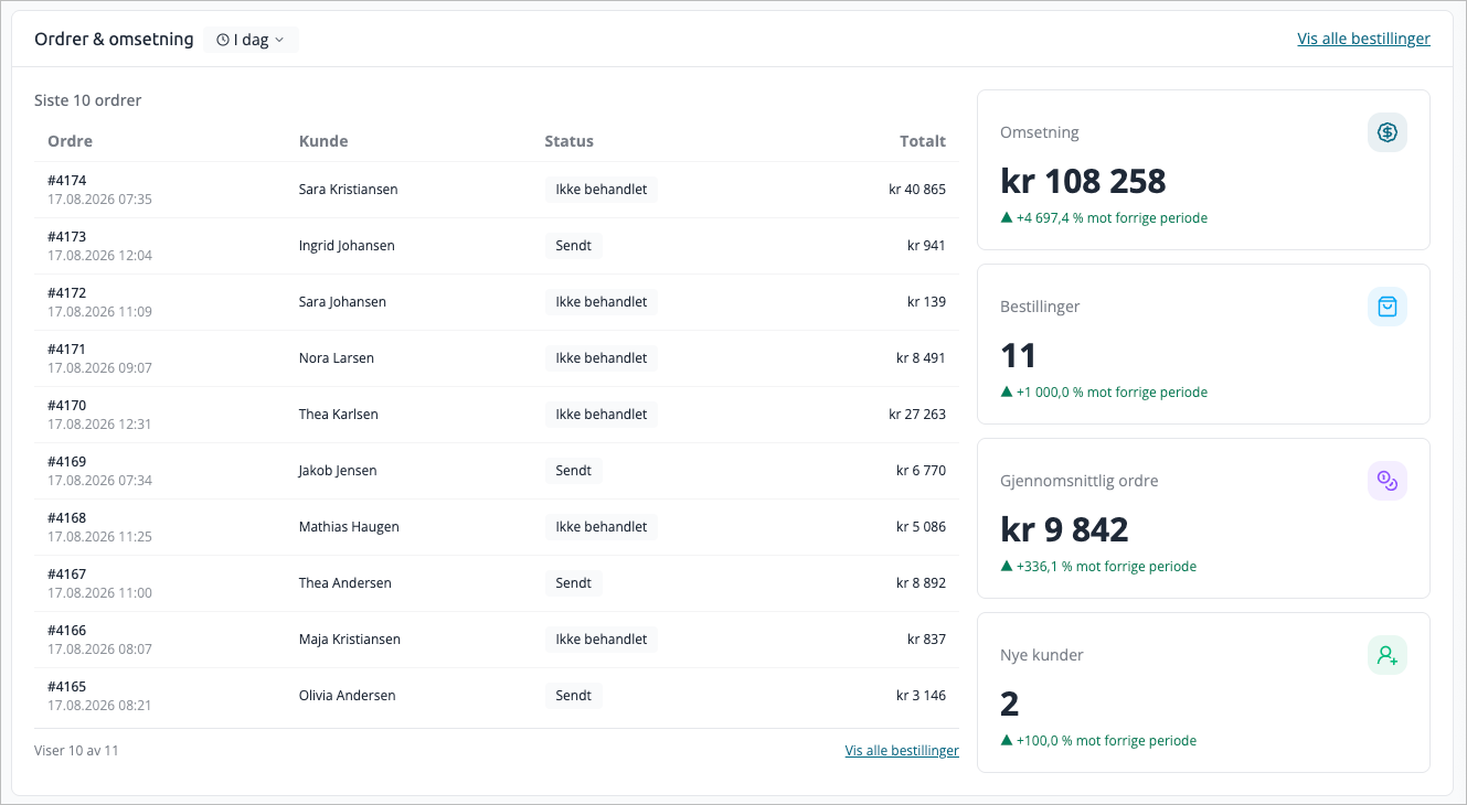
To the left are the last 10 orders in the selected period with order number, customer, status, and total sum. Below the list, it states how many of the total you see, with a link to the full order overview. The order number takes you directly into the order.
To the right are four key figures: RevenueOrdersAverage order and New customers. Each card is compared with the previous corresponding period and shows the percentage change — if you select «Last week», it is measured against the week before. If you have given the section its own period, that is what is compared.
New customers are counted based on when the customer account was created, not on the orders. A repeat customer is therefore not considered new.
Sales, Orders per hour, and Average order value
Sales has its own period. The other two have fixed windows.
- Sales — day-by-day revenue for the period you choose, compared to the previous period of the same length. The default is last month. The text next to the label indicates the length of the comparison period.
- Orders per hour — number of orders per hour, this year versus last year. Shows when customers shop during the day.
- Average order value — average order per hour this year. Indicates when larger shopping carts occur.
Sales plots one point per day, so very short periods provide little to read. Therefore, Today is not an option here, and a custom period can be a maximum of three months.
The sales graph has a toolbar for zooming, panning, and resetting. The two hourly graphs do not have zoom — they always show all 24 hours.
Bestsellers and brands
Two lists side by side: best-selling products and best-selling manufacturers, top 5 in each.
Both follow the period selector at the top, and each list has its own label. You can therefore let the bestsellers follow the top line and at the same time lock the brand list to This year — or vice versa.
Returns, exchanges, complaints, and credit notes are excluded. An item that has been returned does not climb the list.
Inventory Value
Requires Smart or higher, in addition to the Inventory Value Report module.
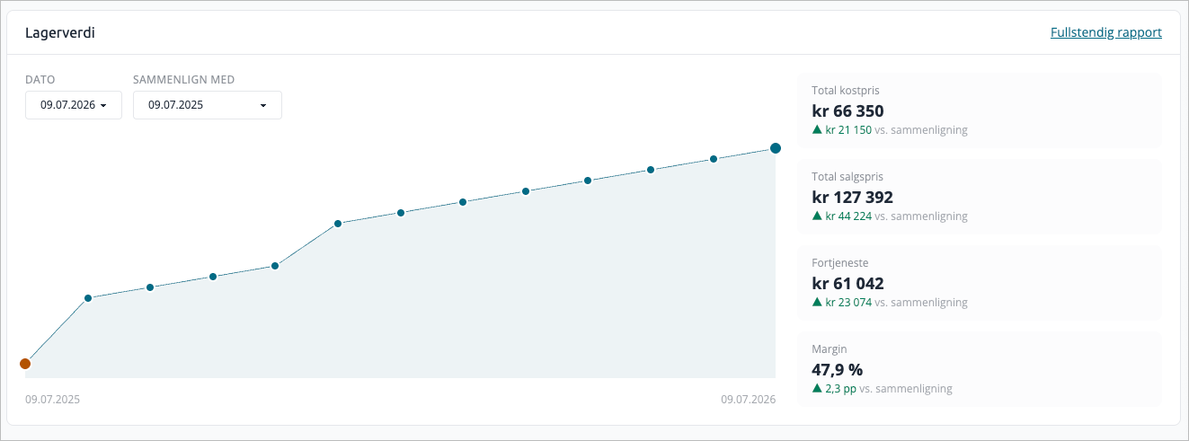
The graph shows inventory cost over time, with the last 30 snapshots up to the date you have selected. To the right are the total cost price, total sales price, profit, and margin for that date.
You can set a comparison date to see the difference. It is automatically set to the same date the year before, if a snapshot exists then.
The figures come from a job that saves one snapshot per day. This means the section is not real-time — the newest date in the list is yesterday's or today's last run.
Payment & Shipping
Requires Smart or higher.
One card with two halves: which payment methods and which shipping methods the orders were placed with. Both halves use the same period, and the label at the top of the card applies to both. Shipping methods are displayed with the name the customer saw at checkout. If there are more than six methods, the rest are grouped under Other
Hover over a field to see the count and percentage.
Promotions
Requires Smart or higher.
A list of upcoming price promotions — regardless of the period in the top bar. Select window (Next 7 daysNext 2 weeks or This month) and filter by ActivePlanned or All
Each row shows start date, name, duration, whether the promotion is synchronized with a category, number of products, and status. Max 8 rows; if there are more, the section links to the promotion timeline.
Planned delivery
Requires Plus or higher, and that planned delivery date is enabled for orders.
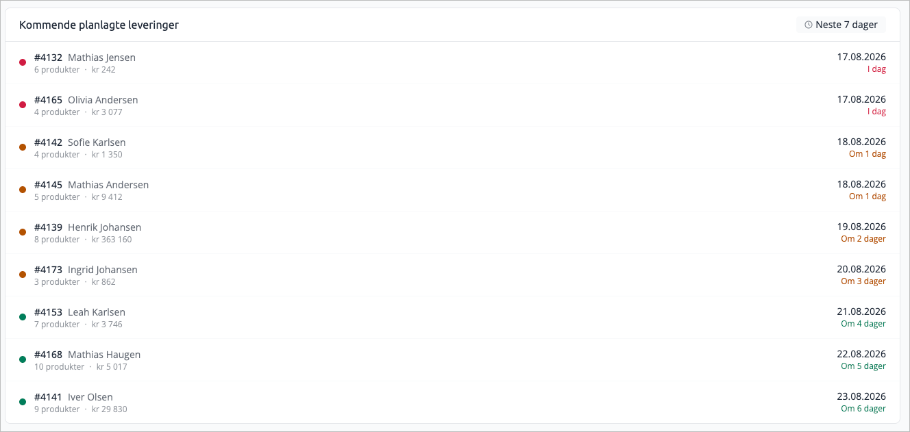
Orders with a planned delivery date within the next 7 days, sorted by proximity. Each row shows order number, customer, number of items, order total, and date. The color of the dot indicates urgency: red for today or overdue, yellow within three days, green after that.
Product checklist
Ten metrics for data quality in the catalog, each with a percentage or a count and a link to correct:
- Products with SEO title
- Products with SEO meta description
- Products with EAN/GTIN
- Products linked to a manufacturer
- Products linked to a stock group
- Categories with SEO content
- Manufacturers with description
- Manufacturers with SEO content
- Hidden products in stock
- Deactivated products in stock
The last two are problem counters, not completion rates — they point to items you have in stock but are not selling.
Reports
Three value cards: Revenue this monthRevenue this year and Orders this month. The revenue cards are compared to the same period last year.
The cards have their own customization menu, so you can hide individual cards without hiding the entire section.
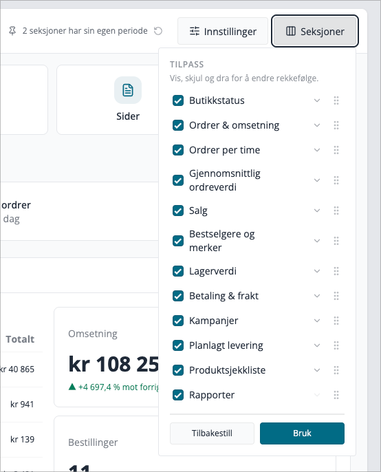
Customize dashboard
Open Customize in the top bar.
- Check or uncheck sections to show or hide them.
- Change the order by dragging the handle, or use the arrows Move up and Move downPress
- Apply
Reset sets everything back to the default layout.
The layout is saved to your user account. Two people logging into the same store can have completely different dashboards.
Hidden sections cost nothing — they are not loaded at all. If you hide the heavy sections, the page loads faster.
If a new section appears in an update, it will show up in its default place. Sections you have hidden yourself will remain hidden.
How the page updates
The dashboard checks every minute for new orders. If there are any, the sections update — but only those that can actually change due to one new order. Graphs covering an entire year remain static, because one order does not visibly move them.
The page is built piece by piece: the framework comes first, and each section fills itself when its calculations are complete. This is why you see gray placeholders for the first few seconds in a store with a lot of history.
Figures for periods that are concluded, are cached for up to six hours. This makes the page fast, but means that a change to an old order — for example, a cancellation retroactively — can take a few hours before it takes effect on the dashboard. Figures for periods that include today are updated within one minute.
Which sections follow the period
The period selector does not control the entire page. Some sections measure something that cannot be placed into an arbitrary period, and others you may have given their own. The label at the top of each section always states what applies there — the table below is the starting point.
Section | Period |
|---|---|
Orders & revenue | Follows the period selector, can have its own |
Payment & shipping | Follows the period selector, can have its own |
Bestsellers and brands | Follows the period selector, can have its own per list |
Sales | Own period, by default last month |
Store status | Always today |
Orders per hour | Always this year vs. last year |
Average order value | Always this year |
Campaigns | Own forward-looking window |
Planned delivery | Always next 7 days |
Reports | Always this month and this year |
Inventory value | Own date picker |
The bottom four measure something different than «a period you choose»: Orders per hour and Average order value compare year over year, Reports compare month and year against last year, and Planned delivery and Campaigns look forward instead of backward.
Sections that require a higher plan
Section | Requires |
|---|---|
Inventory value | Smart + the Inventory Value Report module |
Payment & shipping | Smart |
Campaigns | Smart |
Planned delivery | Plus |
Inventory value and Payment & shipping are also shown on lower plans, but with blurred example figures behind an upgrade message. The numbers you see there are illustrations, not the store's own. Campaigns are not shown at all under Smart, and Planned delivery shows an upgrade message under Plus.
Demo stores
If you try Mystore on a demo, you get two extra elements:
- Countdown at the top of the page showing how many days are left in the trial period, and the button Become a customer. The banner turns yellow when three days are left and red when the period has expired.
- Welcome card with shortcuts to the getting started guide, product registration, design, and the knowledge base, as well as buttons to ask Elvin AI or contact us.
Orders & revenue is hidden by default in demo stores, because a demo is often full of old test orders. Turn it on from Customize if you want to see it.
Design migration alert
Stores still using an old design template will receive an alert at the top of the dashboard: the online store search will stop working on October 1, 2026. The alert will be orange until September 1, 2026, and red thereafter, with a countdown to the deadline.
The alert cannot be hidden, and the corresponding step in the Getting Started list will take the same color. The solution is to switch to the Design Builder template.
Tips
- If you see higher numbers here than in your accounting, check if Show values without VAT is turned off. The dashboard shows incl. VAT by default.
- If you want to compare against last year, use Reports cards — they automatically compare with the same period last year, while the key figures in Orders & revenue compare with the previous period.
- If the page loads slowly in a large store, hide Orders per hourAverage order value and Reports. These are the heaviest sections because they cover a full year or more.The bestseller list follows the period selector. If it looks empty or random, the top line is probably set to
- Today — change the period, or give the list a longer window using the tag in the section.Did a section not change when you switched periods? Look at the tag at the top of it. If it's blue, the section has its own period, and the arrow next to it resets it.